Colour Experiment: Mixing Greens in Oil Paint
Yesterday I decided to do an experiment I have been procrastinating on for a little while. I gathered all the yellows and blues from my oil paint drawer and set myself a challenge: mix them all together and see what greens I could make.
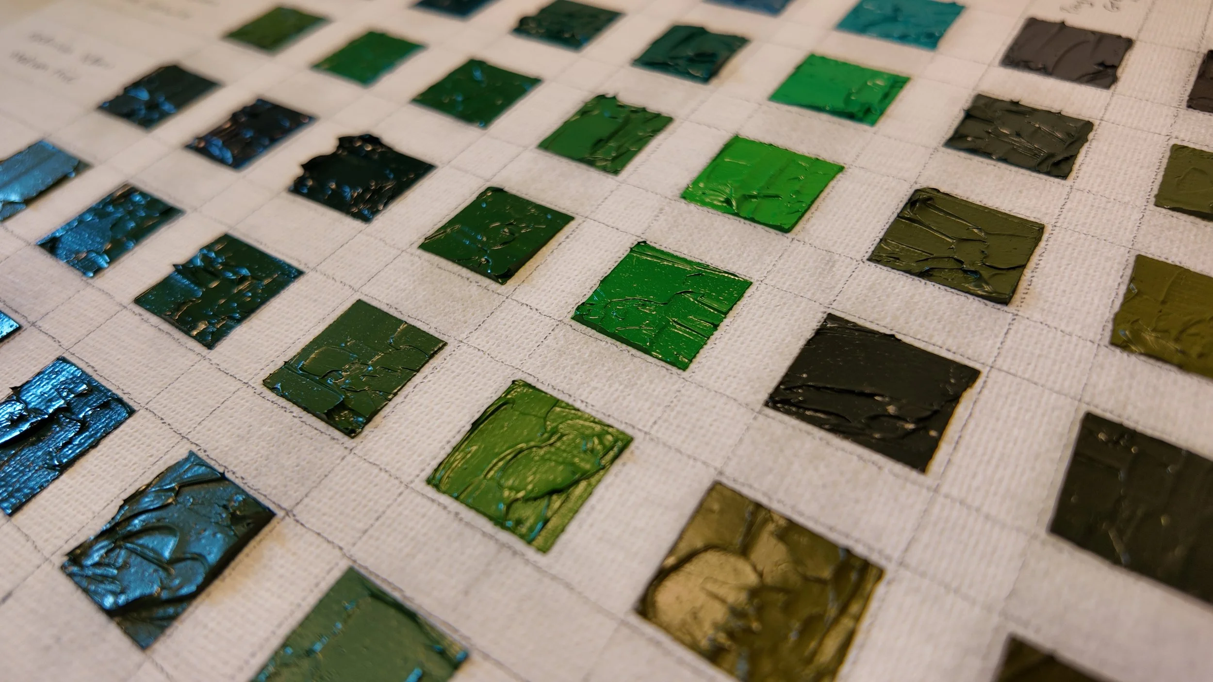
For this first experiment I wanted to keep it really simple — just 50/50 mixes, painted onto a small board as a reference. No fancy ratios, no particularly scientific approach. Pure curiosity.
And honestly, I am so glad I did. It was so revealing!
Why I Did It
Did you know: The human eye has evolved to see more shades of green than any other colour?
This makes the colour both the trickiest and the one with the most potential. Anyone who has tried to paint a landscape knows how hard it can be to get the ‘perfect’ tones for your landscape. They can look too artificial, too dull, or just slightly “off.”
I wanted to start to understand what was really possible with the paints I already own — to see which mixes I naturally gravitate toward, and which I’d probably avoid.

What I Found
Surprising Favourites
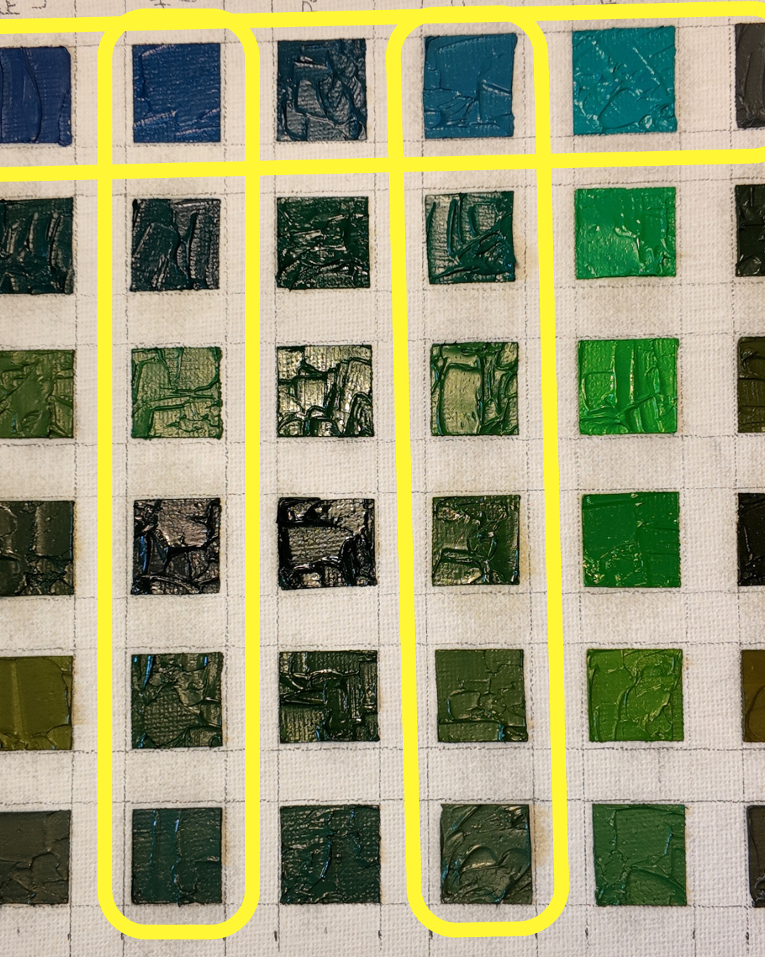
It shows me what colours I am drawn to. I particularly enjoyed the tones produced by mixing with Primrose Yellow and with Prussian and Cobalt Blue. I can see that these could be particularly effective for use in landscape painting. This is really interesting to me, because these are not currently the standard colours that I would choose to use in my landscape painting palette.
Not-so-convincing Mixes
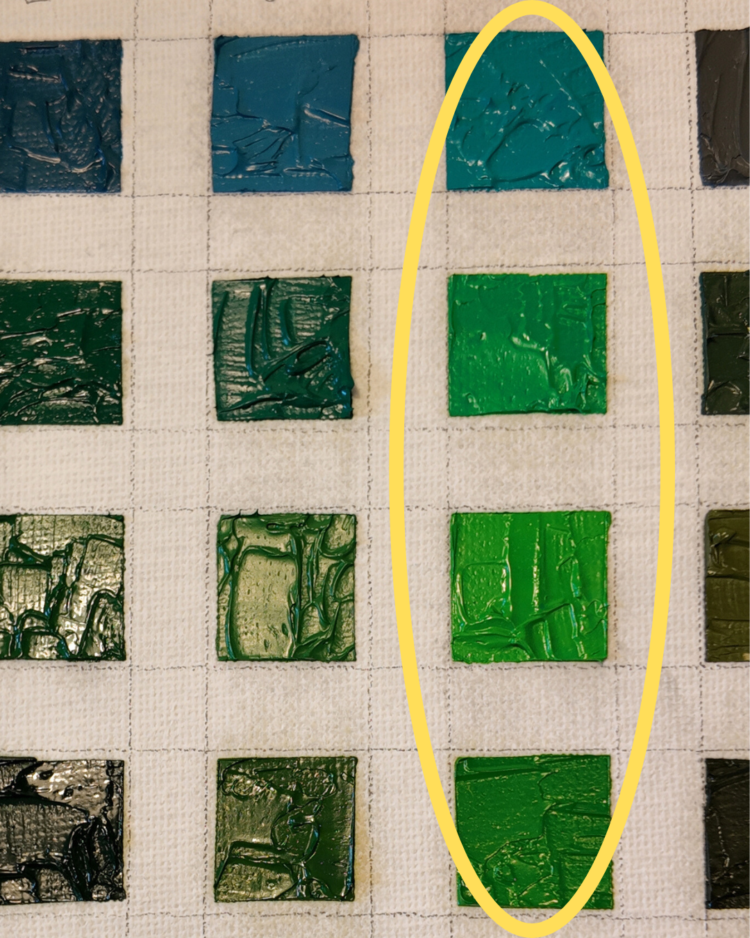
I could see that the pigment strength of Pthalo Turquoise is very strong and can create some very unnatural shades of green which would never really be seen in nature. Cadmium Yellow Pale Genuine and Pthalo blue also have strong
Pigment Strength Matters
Whilst I already knew in practice that certain pigments are stronger than others, it was really useful to see this in practice. Primrose yellow and lemon yellow were really delicate in comparison to stronger pigments. In a 50/50 mix, they tended to get overwhelmed. Meanwhile, phthalo blue and phthalo turquoise completely dominated, creating bold, saturated greens that could easily take over a palette.
Lining them all up made these differences so obvious — something you’d never fully notice if you were just mixing ad hoc while painting.
Why It’s Useful
This little chart is now a reference I can come back to again and again.
Which colours feel most natural for landscapes.
Which mixes to avoid if I don’t want that “artificial” look.
Which pigments I need to handle carefully because of their strength.
More than that, it’s given me ideas for the next step. I’m thinking of diving into more structured colour-mixing exercises (inspired by Richard Schmid’s method), where you take a single colour and explore many possible mixes and ratios. That way, I can really see which greens might become staples in my palette.
I’m also tempted to see if I can paint a landscape with only the colour mixes that I made in this exercise as I can see certain groups of colours really lend themselves to that.
Final Thoughts
If you’re an artist, I’d really encourage you to try this. It only took a couple of hours to do. Set aside an afternoon, line up your blues and yellows, and mix them all. You’ll probably be surprised by what you discover — and you’ll come away with a much clearer sense of the colours you’re working with.